One page, one ask, and a hero made out of banknotes
part of Investment Banker/Analyst Portfolio
A month on a one-page site for a NEPSE portfolio manager. The order of the page, how the hero animation is built in CSS, and what the form asks before it asks for a call.

- problem
- Prajesh sells portfolio management to people who have to hand him money first. He needed a page that earns that in one scroll, and that he can rewrite himself without a developer.
- my role
- Designer and developer
- outcome
- One page ordered around the questions a buyer asks, ending in a form that asks what a first call would. Every section of it is an entry in a Payload admin running inside the same app.
- stack
- Next.js
- React
- TypeScript
- Tailwind CSS
- Payload CMS
- Vercel
- Cloudflare R2
- NeonDB
Prajesh Sagar is an investment banker in Kathmandu who runs private portfolios on the Nepal Stock Exchange. What he sells is a person: a stranger reads a page, then decides whether to hand over money and a phone number.
So the site is one page with one ask, and everything on it is arranged around that decision. I designed it and built it, in a month.
The page is ordered the way the questions arrive
A visitor asks the same things in roughly the same order. What is this. Does he really do it. Who else trusted him. What would he do for me. What has he done before. What happens if I get in touch.
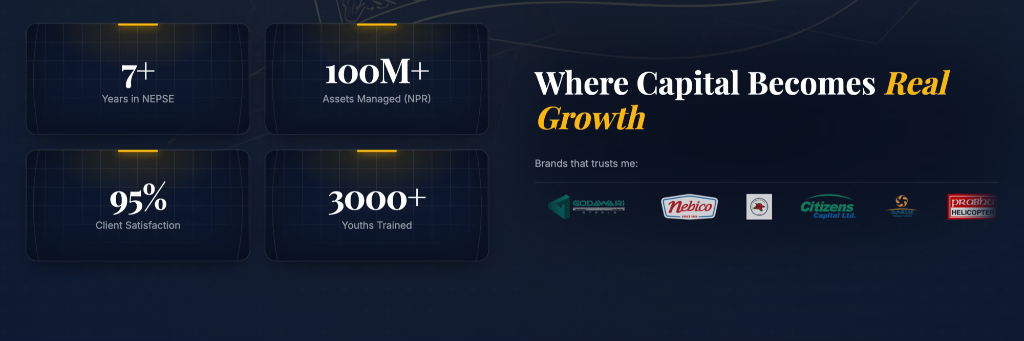
The sections run in that order and nothing sits between them. Headline and one button. Four numbers. The logos of firms he has worked with. The services. The values and the quotes. Three past portfolios with the strategy and the result written under each. Then the form.
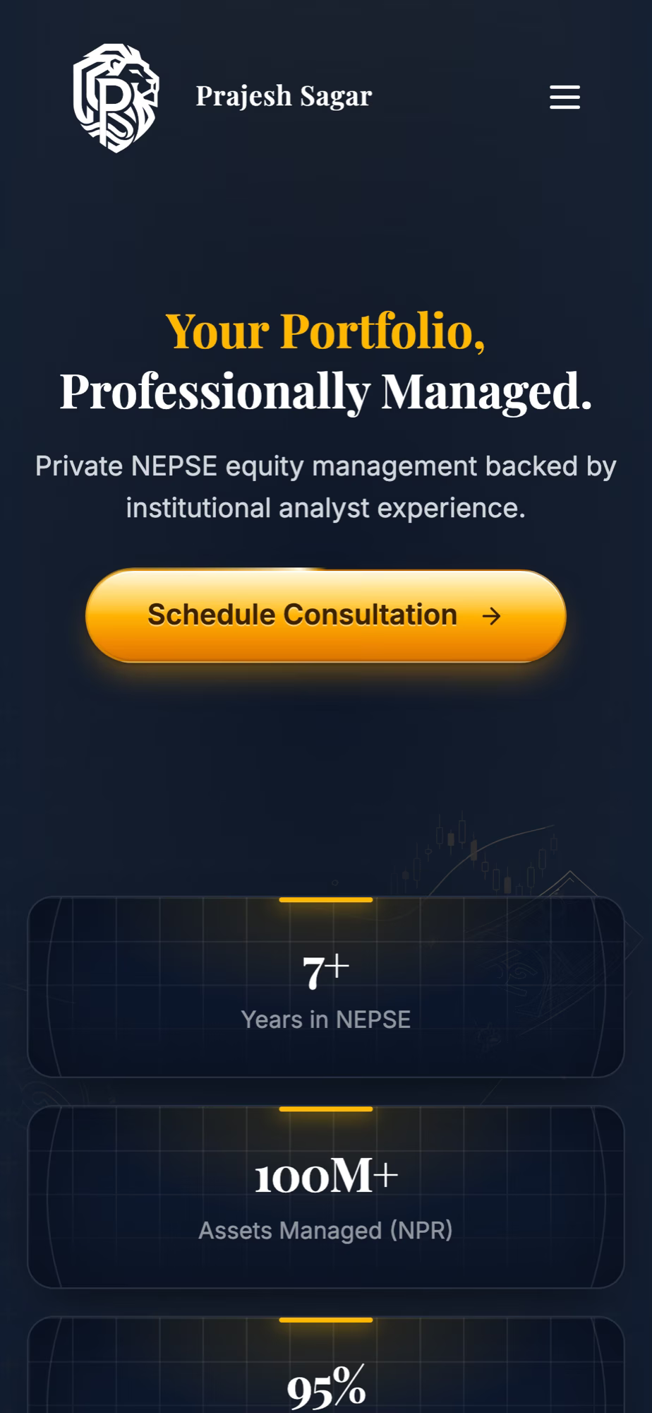
The hero is not a full screen tall. It is sized to the viewport minus a fixed strip, so the stat cards start inside the fold and are cut off by it. That is the whole trick: the first scroll lands on a number instead of on more headline. On a phone, where most of these visitors stop within one screen, that strip does more work than any rewrite of the sentence above it.
There is one ask and it never changes. The button in the nav, the button in the hero, the button under the video and the form all point at the same place. A second offer would give a reader a way to feel they have acted without acting.
The hero moves like the thing it is selling
Behind the headline are six line drawings: Nepali banknotes, a rising wire, a candlestick chart. Each one is its own layer, and each layer carries its own distance, rotation, duration and start time as four custom properties. A single keyframe reads those four and moves the layer, so the drawing at the back travels six pixels across and eight up over seventeen seconds, and the one nearest the reader travels sixteen and twenty-two over nine.
That ladder is the parallax. Nothing measures the pointer and nothing measures the scroll; depth here is the fact that near things move further and faster than far ones.
Two more details keep it from reading as a loop. The animation runs alternate, so a layer eases back along its own path instead of snapping to the start. And every layer has a negative delay, between one and eight seconds, so each one is already part way through its pass when the page loads and the six are never in step.
It is CSS. There is no canvas, no animation library and no JavaScript in it, and every property being animated is one the compositor can handle on its own.
The cost is weight, not frames. The drawings are vector, and two of them are large. Those two are behind a <picture> element with a desktop media query, so a phone requests four files instead of six and gets a quieter version of the same idea.
Under prefers-reduced-motion every animation on the page stops, including this one and the two marquees, and the drawings stay exactly where they are. The hero still looks like the hero. It just holds still.
The button does the other half of the work. It is the only saturated object on a dark page, and a single arc of light travels its edge once every three seconds. One arc, one colour: a button that pulses or changes colour reads as an advertisement, and this one has to read as the thing you press.
Six services, two sizes, and a checkbox that decides which
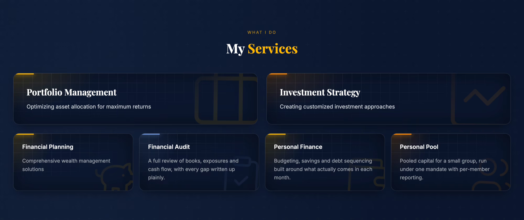
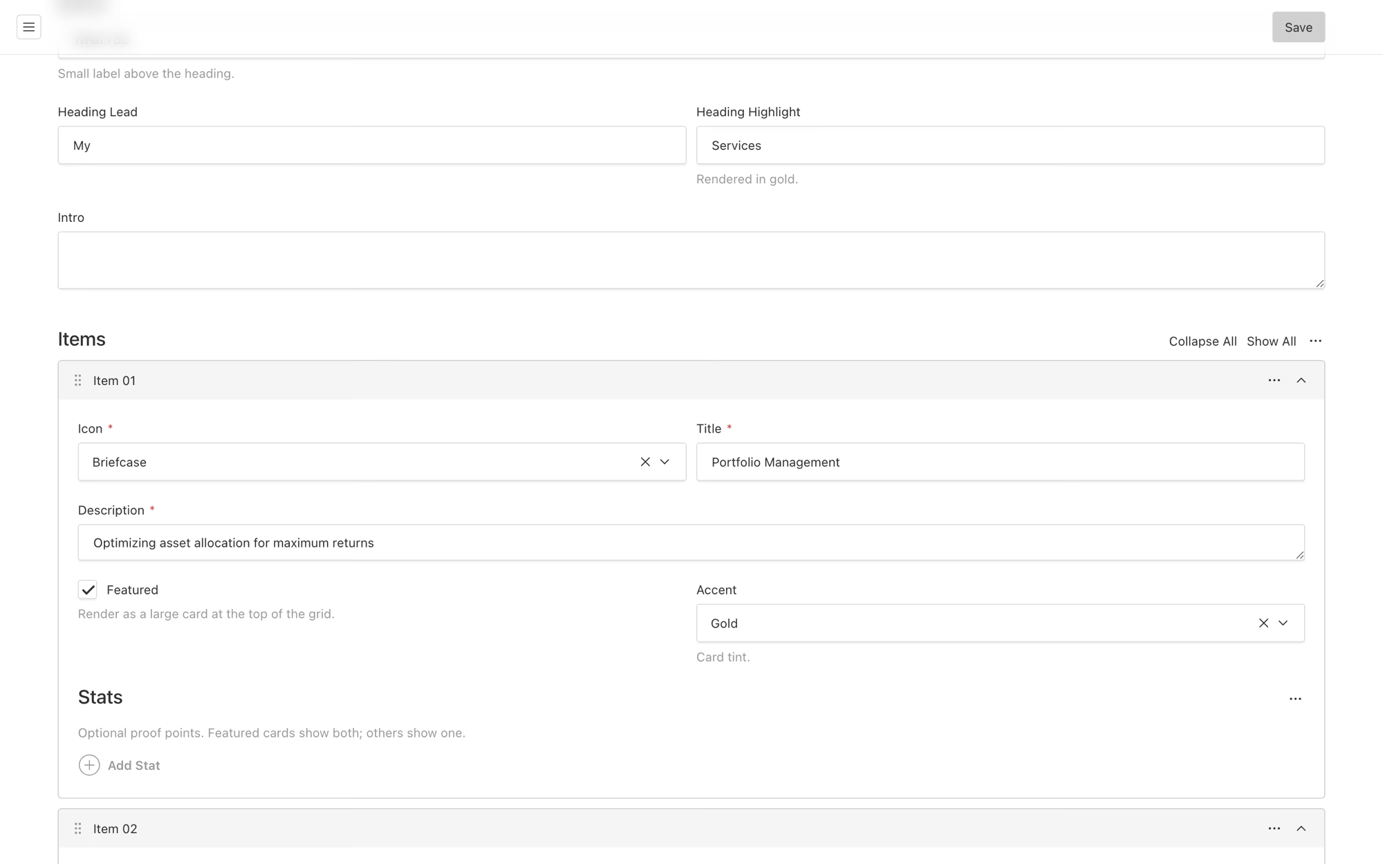
The services grid is two wide cards over four narrow ones. That is not two components. It is one item in the CMS with a checkbox on it, described in the admin as "render as a large card at the top of the grid".
The icon is a picker, the accent is a picker, and both write into a fixed set that the page knows how to render. Prajesh can add a seventh service, tick the box, choose an icon and get a grid that still looks like a grid. He cannot pick a colour that does not exist in the palette or an icon that does not ship, which is the point of a picker over a text field.
The form asks four questions before it asks for a call
Under the phone number are three rows of chips: what brings you here, roughly what are you managing today, and how soon do you want to move. Then one open box.
That is the first fifteen minutes of a discovery call, asked in advance. A portfolio review for someone just starting out and a review for someone holding five crore are different conversations, and knowing which one it is before replying is the difference between a useful first message and a request for a meeting to find out. The line under the form says the details stay with him, which is the objection anyone typing a portfolio size into a stranger's website is having.
They are chips rather than dropdowns because the options are the argument. A reader who sees "Rs 5 crore+" in the list learns that clients at that size exist here.
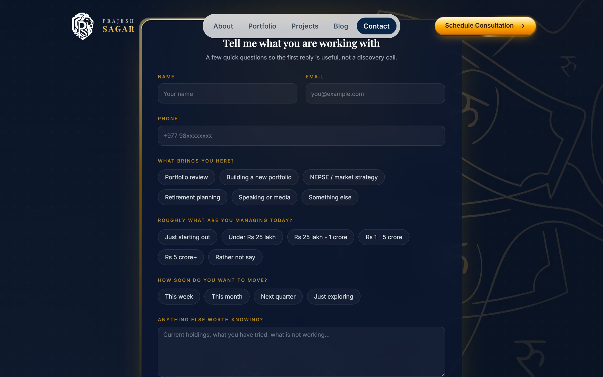
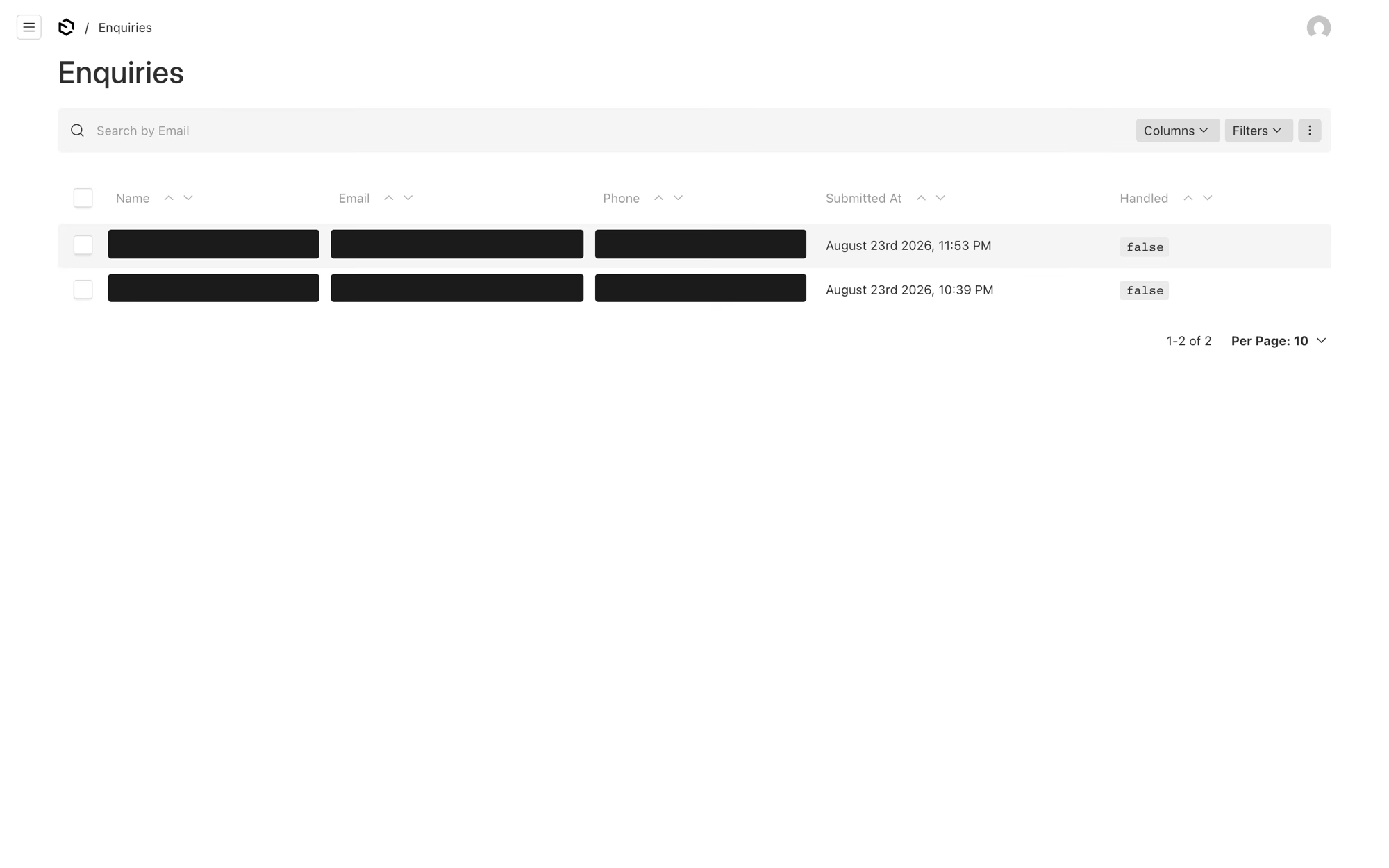
Every submission lands in the CMS with a handled flag on it, so the admin is also the inbox.
Payload instead of Strapi
The last two sites I built ran on self-hosted Strapi: Marti China, because hosted APIs are unreliable inside mainland China, and Noveon, because a firm with a compliance officer wanted the content on a server it owned. Both reasons are about where the CMS sits.
Neither applies here. This is one person with one page, no ops budget and nobody to keep a second server patched. Payload runs inside the Next.js app itself: one repository, one deploy, one admin at /admin, and media on a CDN domain of the site's own.
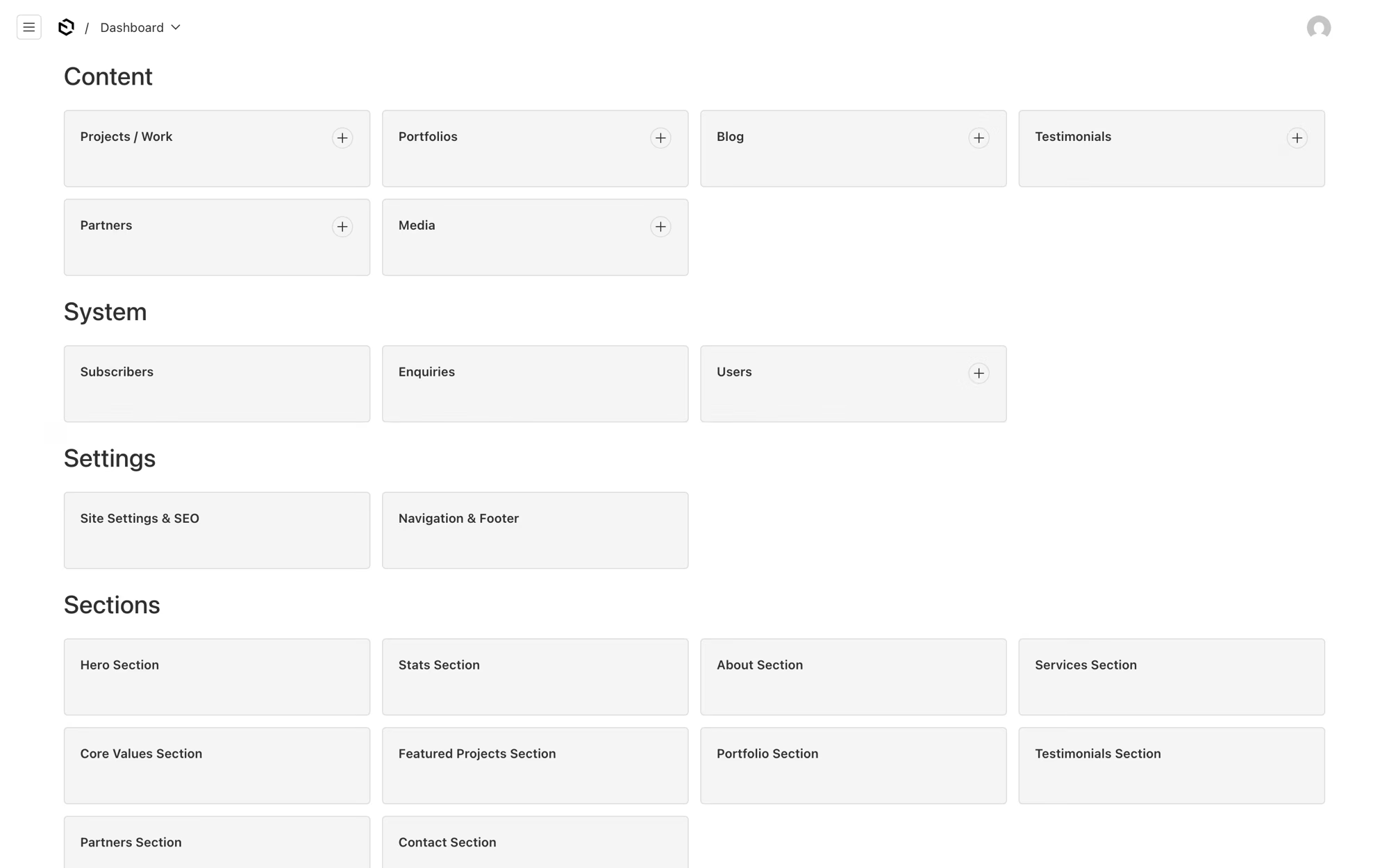
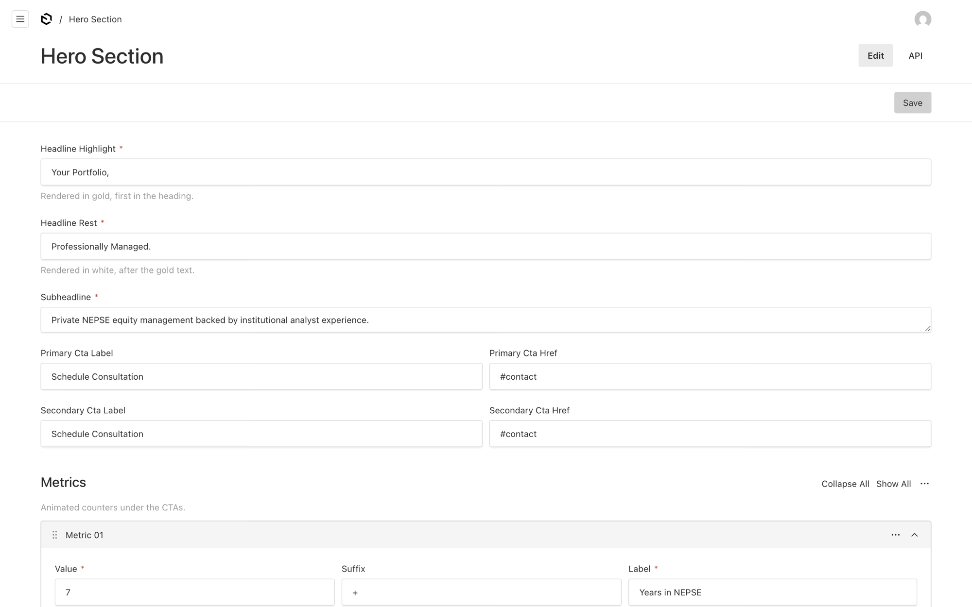
Every section of the landing page is a separate entry in there, and so are the navigation, the footer and the SEO fields. The hero is not a rich text field; it is the gold half of the headline, the white half, the subheading, both button labels and four counters, each with a value, a suffix and a label. The help text under each field says where the words come out, in the words a person who is not a developer would use.
The other consequence of Payload living in the app is that the page is rendered on the server. The HTML that arrives at a browser already has the headline, the services and the quotes in it, which is not true of the two Strapi sites, where the browser fetches the content after the shell loads.
What is not on the page yet
The projects section is published and empty. It has a written empty state and not a blank panel, because a page that says nothing is added yet is a page that says the practice is real and the list is coming.
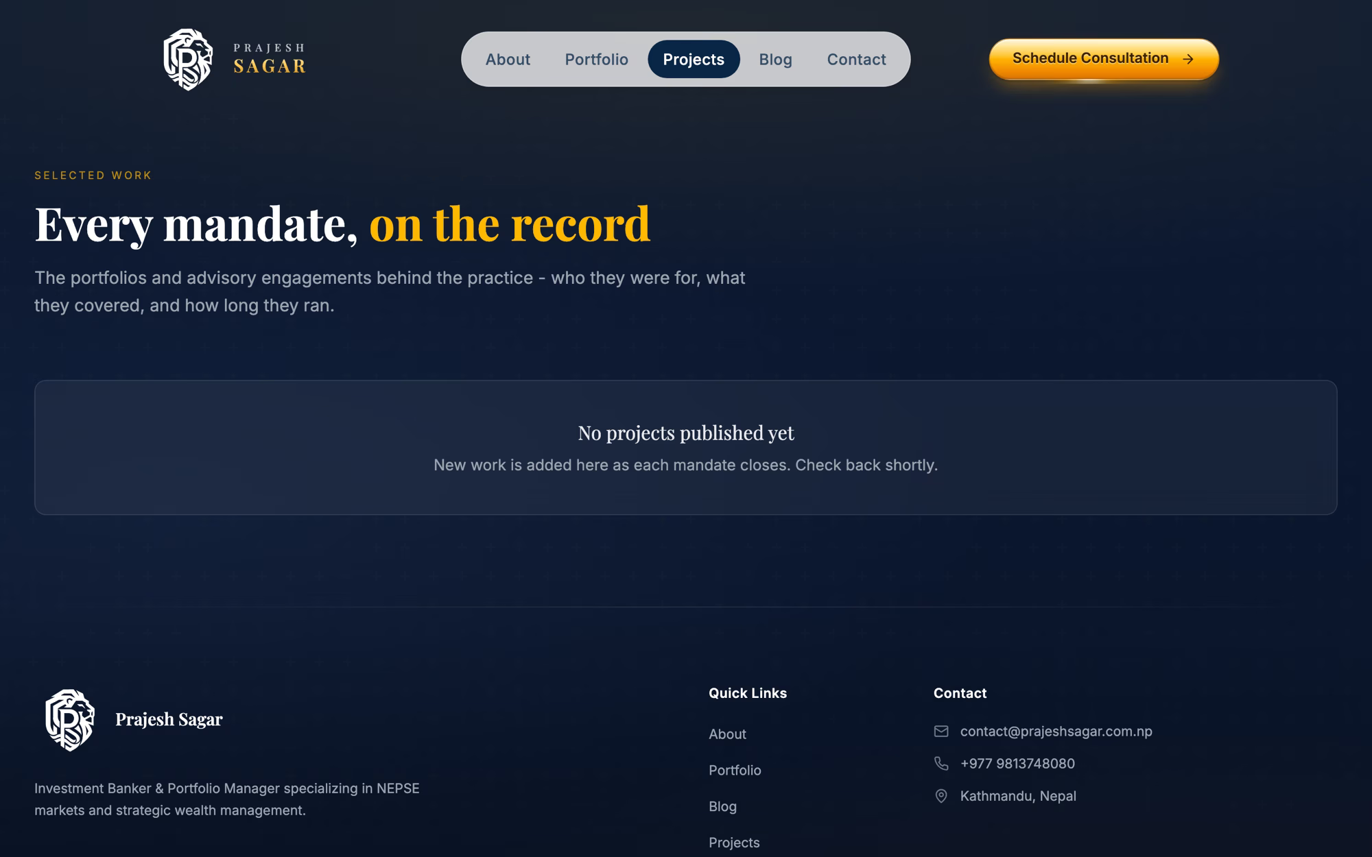
The blog has one post in it and it is a test. Both of those are Prajesh's to fill, and the fields are waiting.
What he has is a page he can rewrite on a Sunday, and an inbox that tells him what somebody is holding before he picks up the phone.